

Table of Contents
An out-the-box visual snapshot of the top downloaded Obsidian themes for your procrastination pleasure. Plus the next one for you to try.
As I was procrastinating writing my 2000 words this morning, I found myself in the themes section of Obsidian. If it’s one thing that Obsidian is absolutely amazing for, it’s procrasti-creating. A little bit of tweaking here, a little bit of rearrangement there, oh it feels like such a great use of my time!
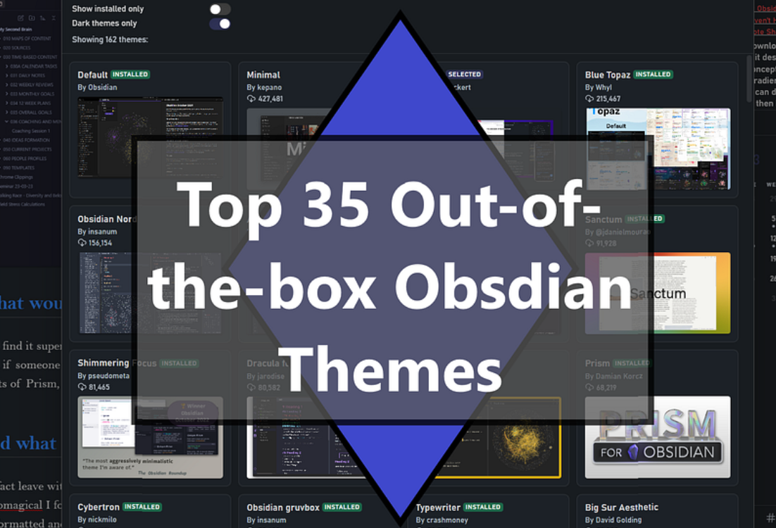
Therefore I thought I would help you procrasti-create further by giving 35 ‘out-of the box’ screenshots of the most downloaded Obsidian themes at the time of writing (April 2023) - now with the NEW 2026 update. You are welcome, by the way, for your upcoming procrastination, I mean productive, reading and trying-out-new-Obsidian-themes session! This is for everyone, like me, that hasn’t currently delved into the myriad of style settings and custom css options. Ironically, also for people who don't want to spend time fine-tuning the design - you just want it to work...
These are ranked in order of most popular, or at least most downloaded, so the users are the deciders of this best list, not me! I’ve put downloads in brackets (2023 -> 2026). Which have stood the test of time I wonder? Which have fallen by the wayside? And which are consistently the most desirable themes?
One thing of note, that you probably want to do before trying out themes, is to install the ‘StyleSettings’ plugin. Now you could argue 'but that's not out of the box', you'd be right, but some need it to work correctly. Some of the differences are very subtle. For example in Blue Topaz (2023), the tags changed colour and the bolded text no longer had a slight grey background.
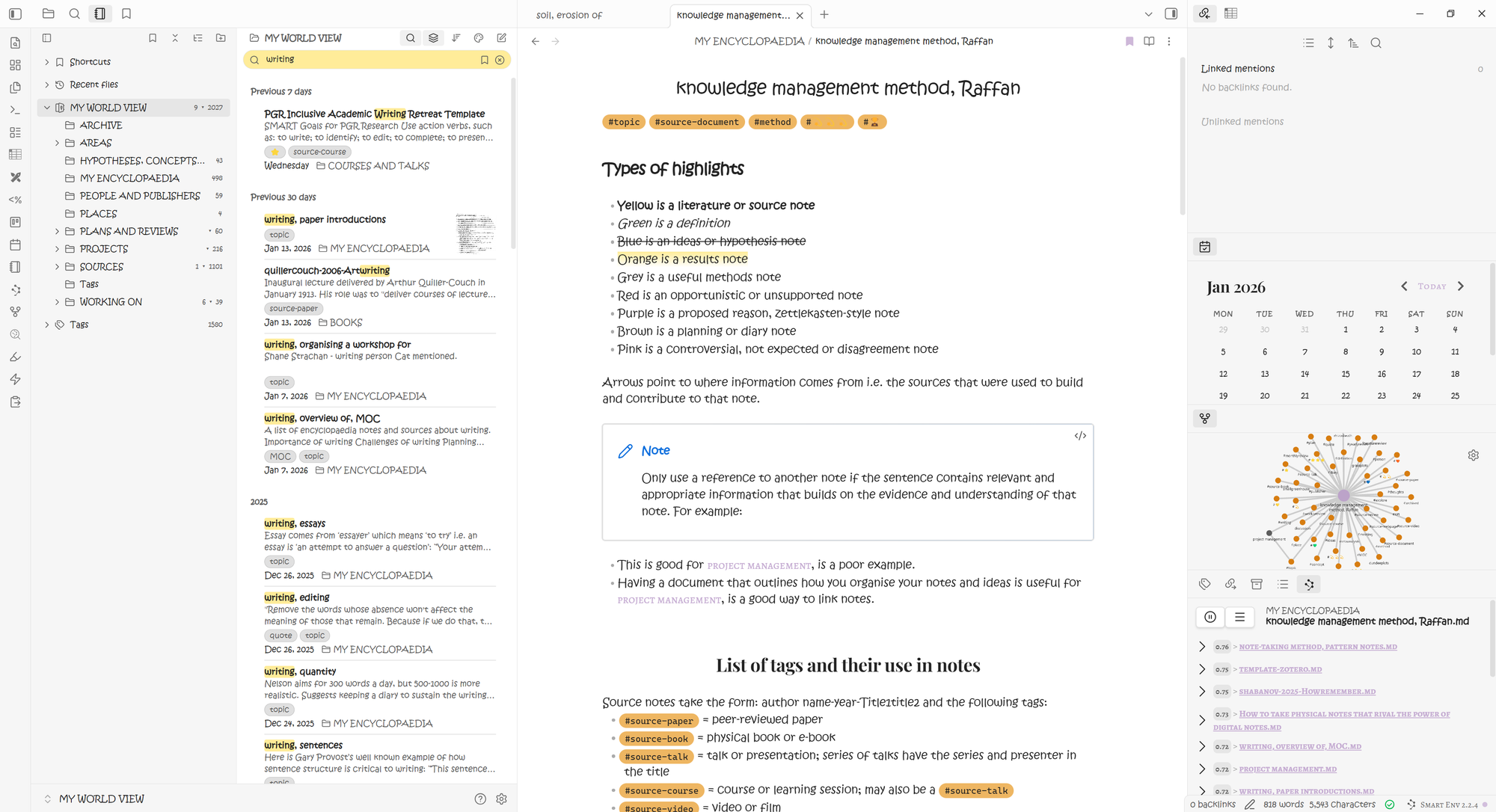
I’m using my 2023 and 2026 vaults to illustrate the themes and my file I use to make sure I keep to all my vault formatting 'rules'. OK, I also had to do a little housework in my vault first, just so there was nothing illegal... I mean secret projects... on view.
I’m going to comment on them very briefly as I go along. You may well have different opinions because a theme is very personal. As a general rule, I tend to switch between light and dark mode depending on my mood. I also like headings that stand out from the text, and you will see this in the comments as we go. As someone who navigates visually I like consistent colours between light and dark - this is tricky to do and many themes don't manage.
I also have purple set as my accent colour which I will not change throughout. I also use Kristen ITC font as of 2025. Because we’re going all arty farty I’m also going to consider how the theme designers used their inspiration and/or name to influence the design choice. This is a super way to take a deeper look at the meaning and effort put into the little things as well as the general look.
This is not a super complete review, merely a 2 minute delve into each of the themes for a first impressions look. I think we can generally agree that 2 minutes, even 30 seconds, is enough time to consider whether we like an out-the-box theme or not, and therefore whether we are willing to go deeper into our own tweaks in Style Setting. It takes a lot more effort to go delving into the other not ‘out-of-the-box’ features - this post is designed to help you choose which ones to eliminate and which ones to put on your short list.
Important note: These numbers are not indicative of current usage because there are plenty of nuances in how these numbers come to be. But I would argue that the number is directly proportional to interest in them in the first instance.
This sort of post brings me the utmost joy and pleasure to bring you. I love delving into lists like these, exploring all the options and sharing them with you. I hope that you find it useful. Here we go:
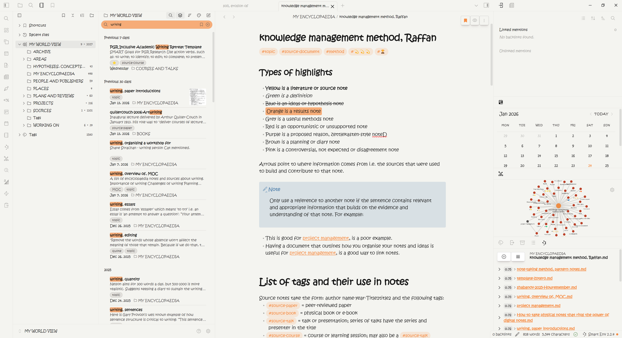
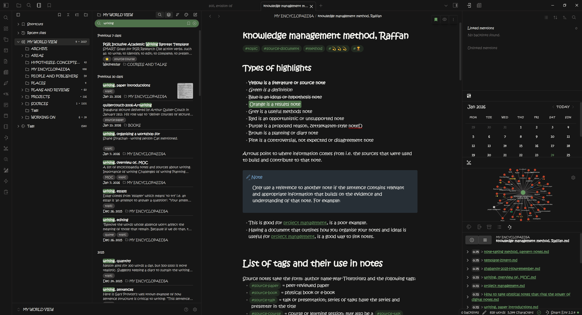
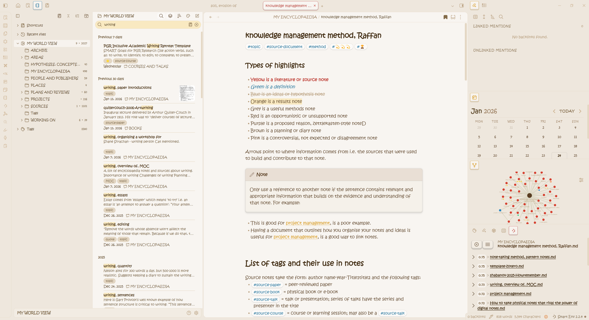
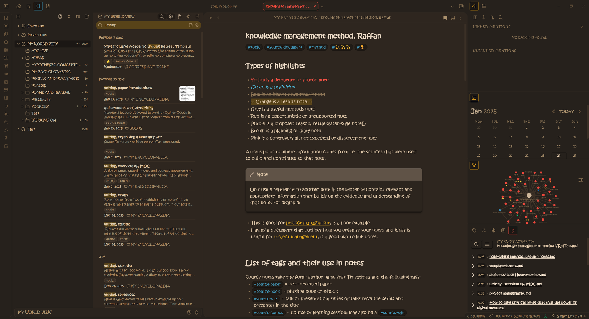
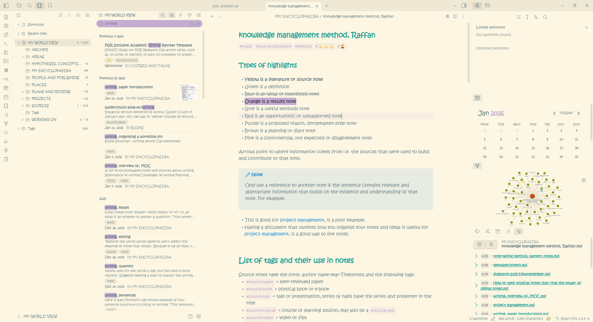
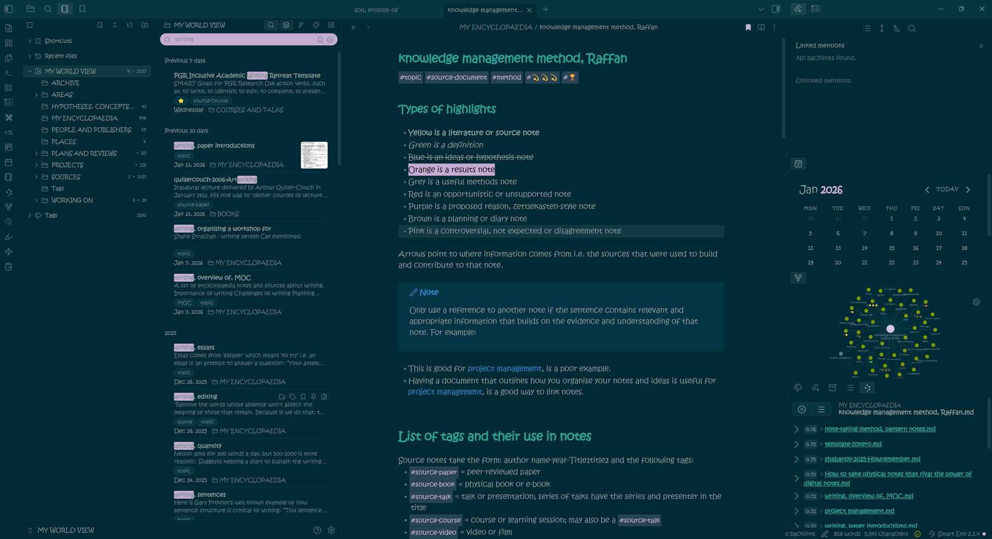
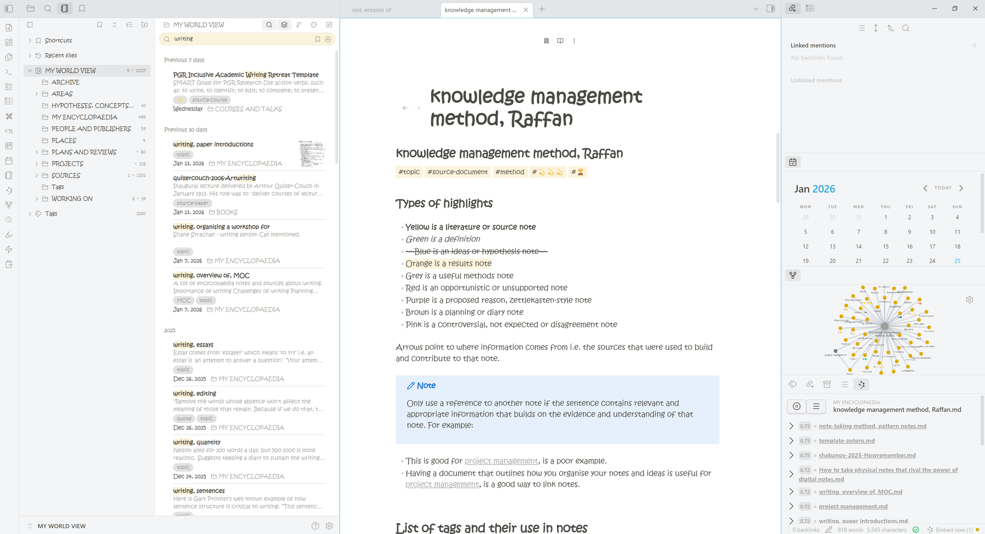
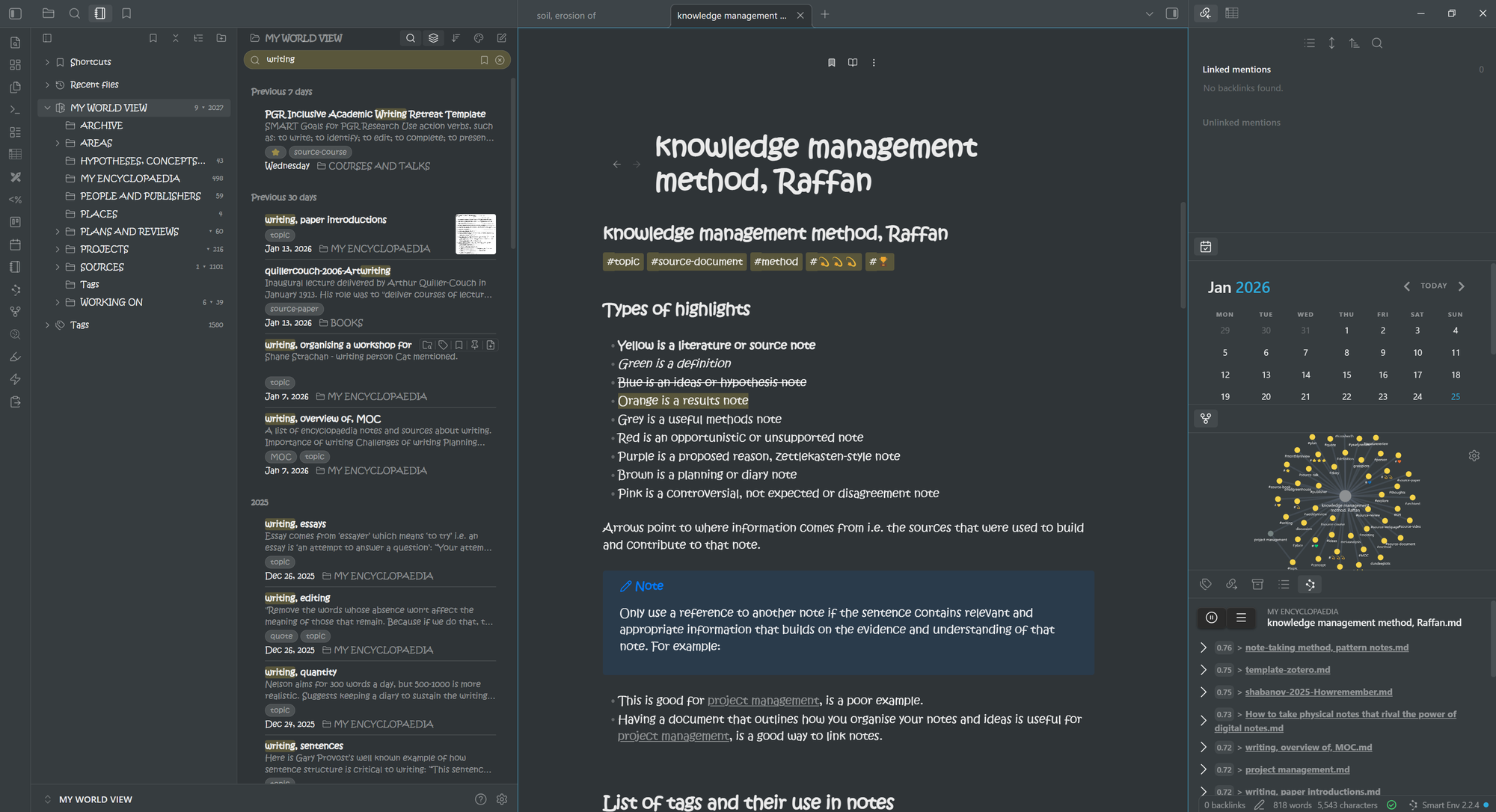
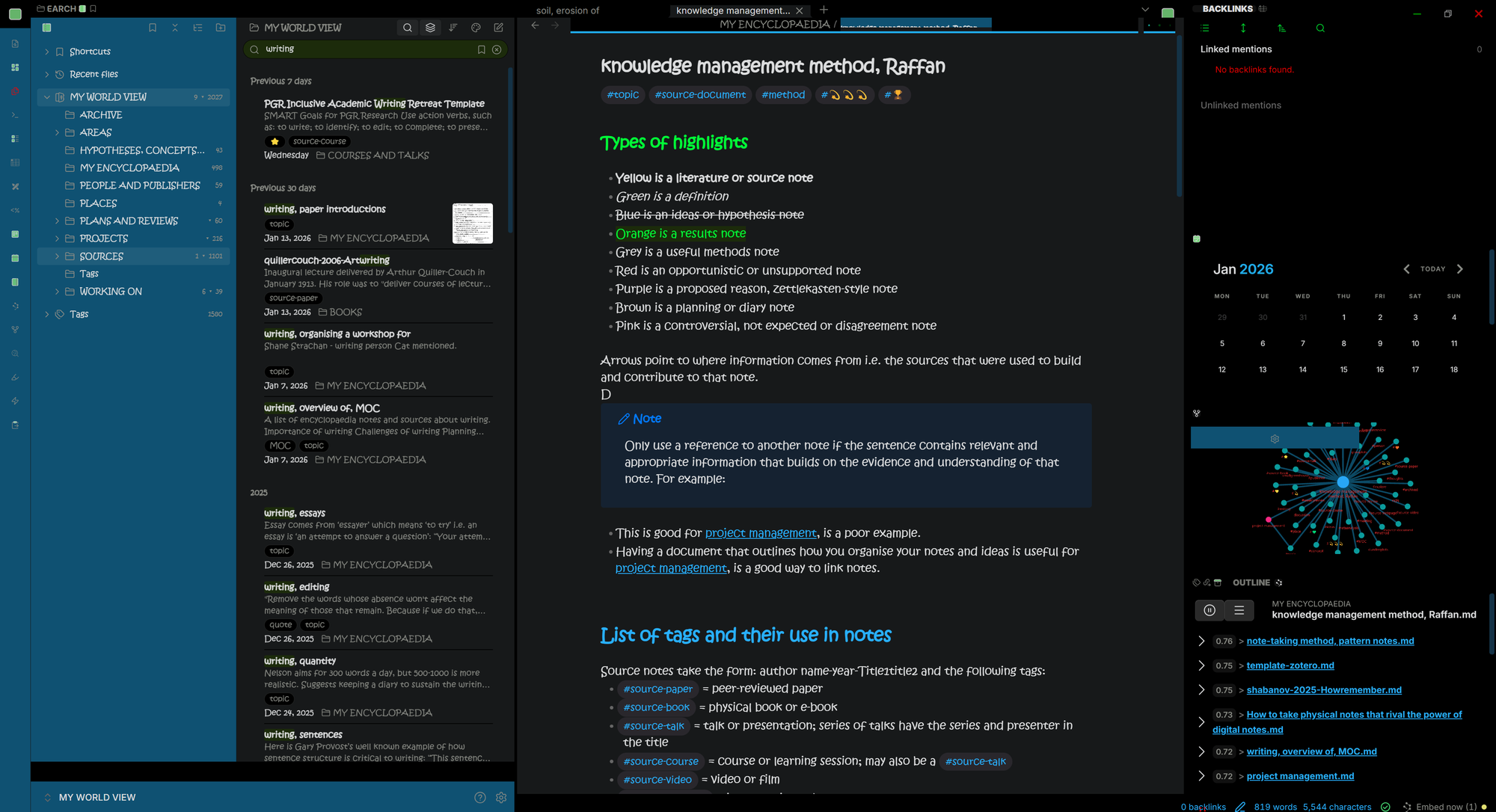
1. Default by Obsidian
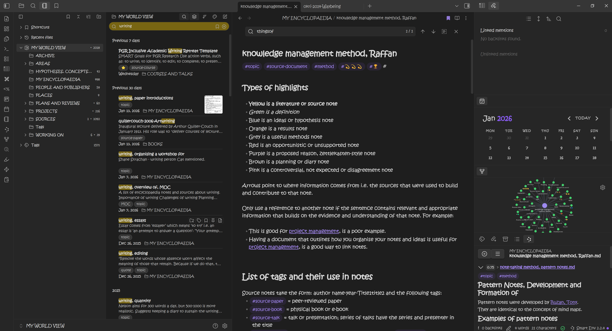
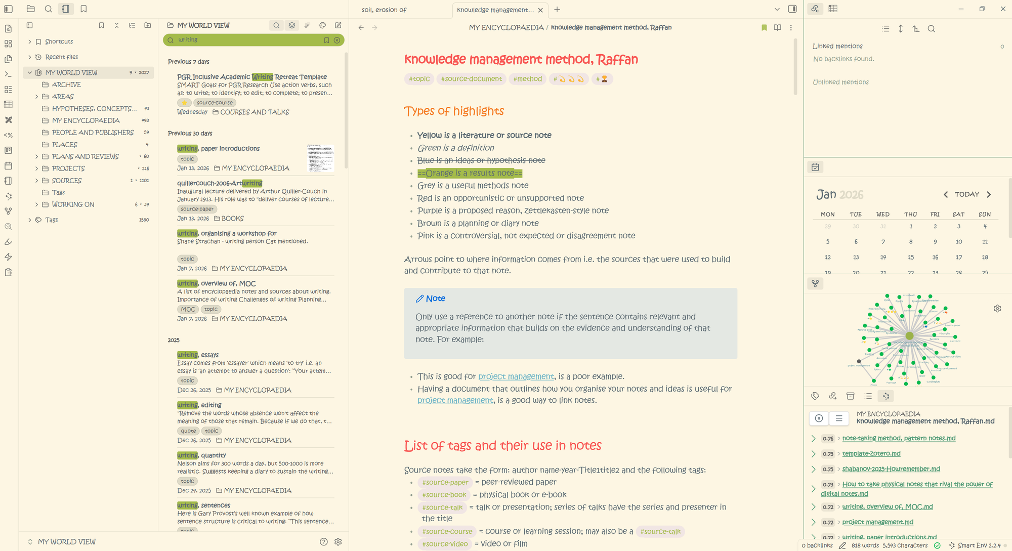
“A simple theme designed to feel intuitive across all platforms. Supports light and dark mode.”
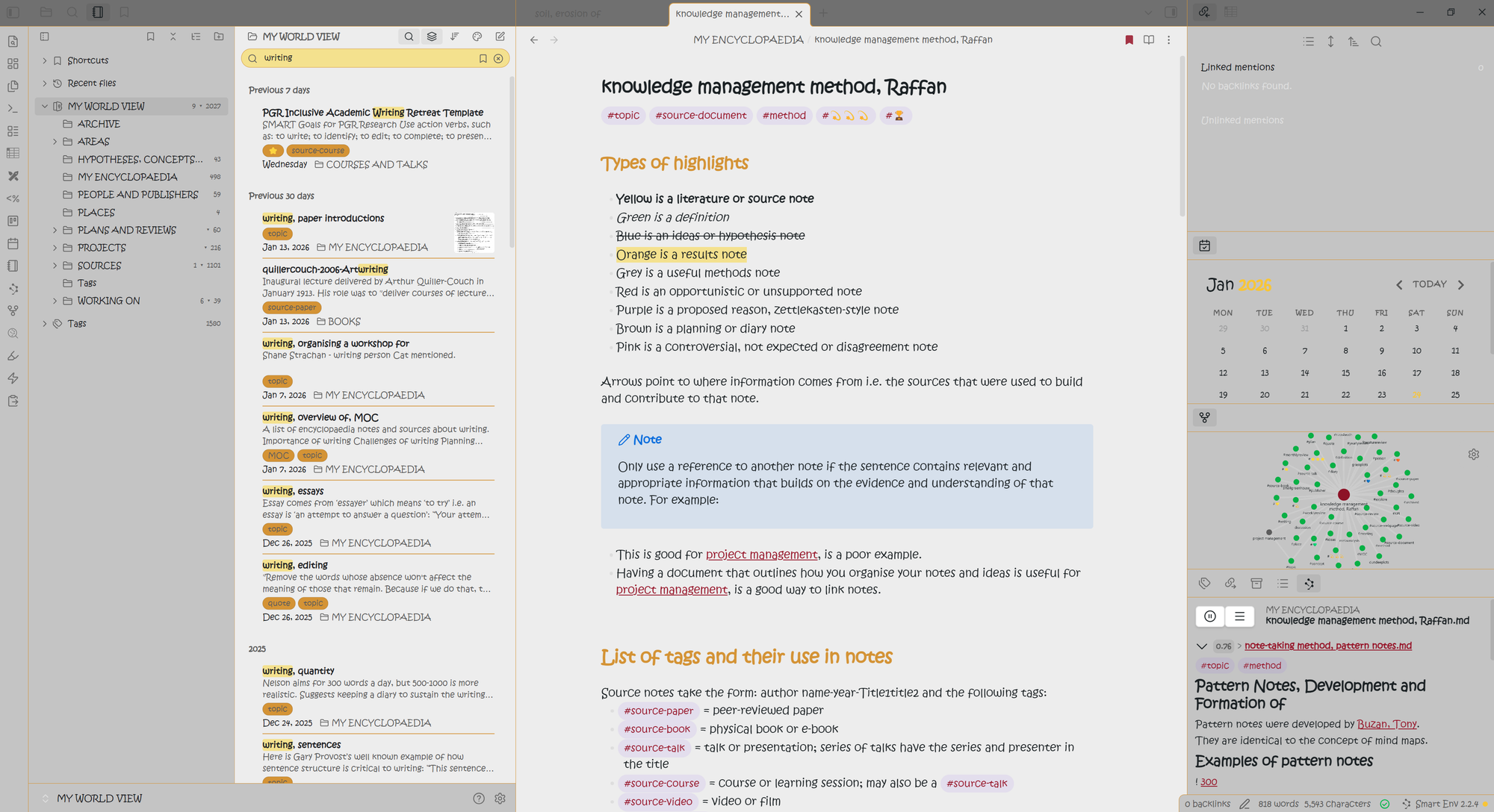
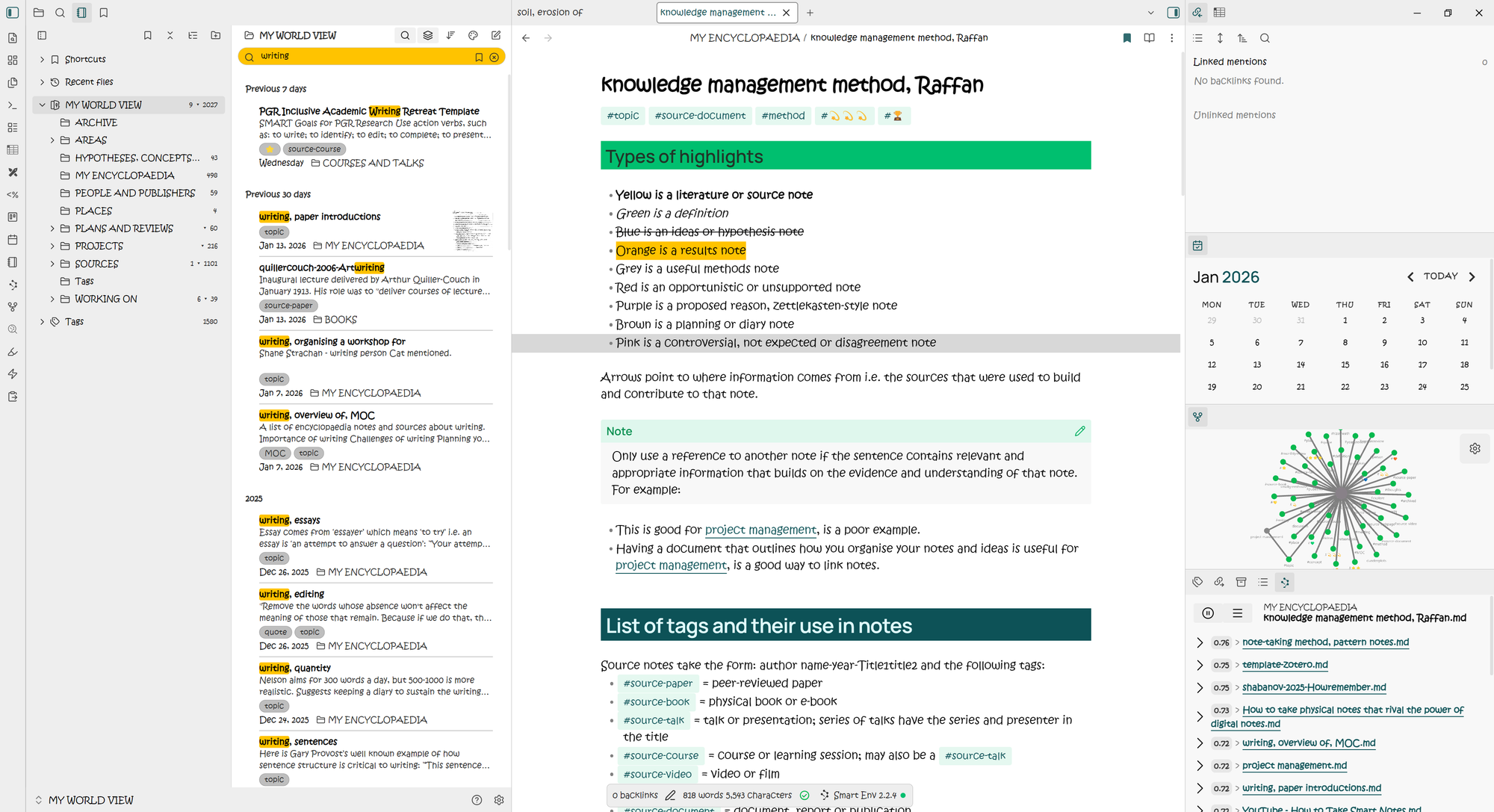
This theme will always hold the top spot by default... I think the default theme works best in light mode. I find the links and tags difficult to discern in dark mode. Light mode is clean, the base font is nice and I think it is generally pretty good. One thing I don’t like about this one, is the headings can be a bit tricky to discern from general text particularly if you want to hone in on a section. You can see the base colour clearly coming through in 2026.
2. Minimal by kepano (427,481 -> 1,987,443)
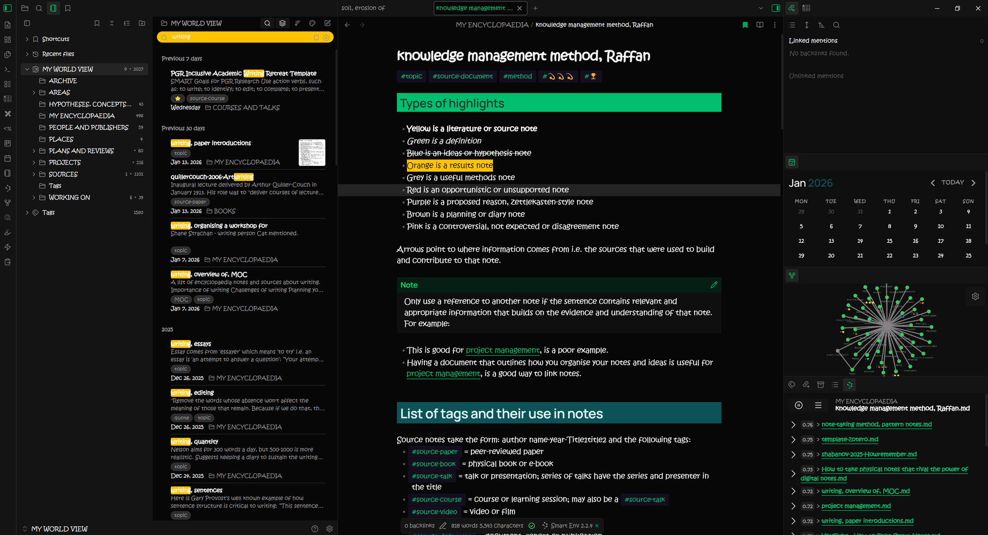
Now CEO of Obsidian, kepano designed the most popular downloaded theme and second only to the default Obsidian install; the true number 1 perhaps? A sign that its basic, no-frills styling is well-loved. In fact, by number of downloads it blows every other theme out of the water. I can see why people love it, with its clean interface, writing at the forefront, but it’s not for me. I don’t like how small the headings are so the sections in my text aren’t obvious.


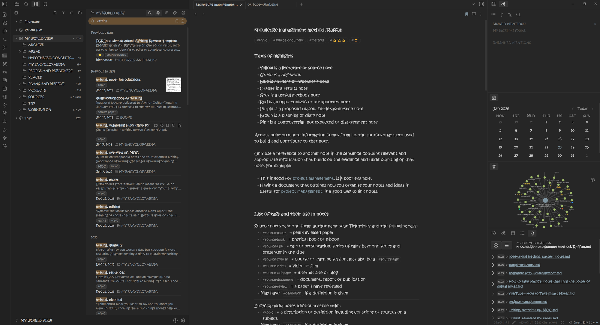
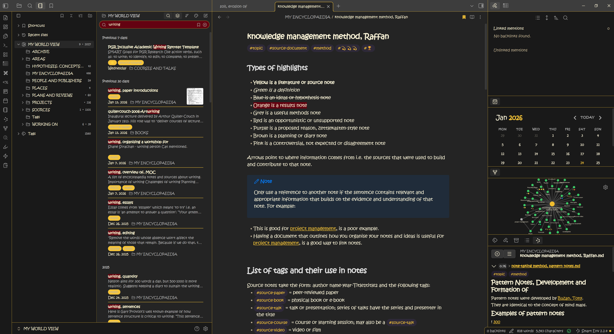
3. Things by colineckert (275,354 -> 1,037,778)
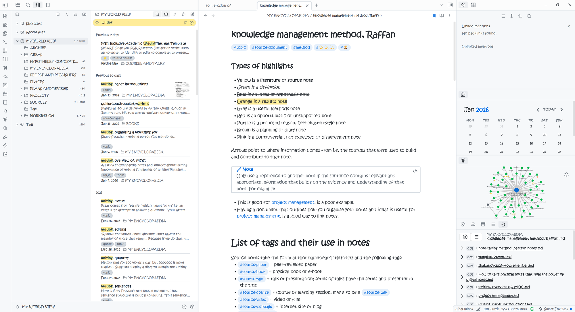
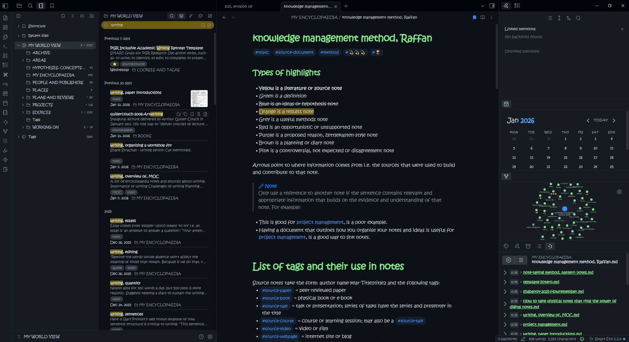
I really like the ‘Things’ theme. Modelled on the Things 3 app, it has really nice use of colours and is clean and simple. I think it looks better in light mode than dark mode, but this is a good one for me. I like how the bold text is a different colour from the rest of the text, helping it stand out more. I also like the colour separation in the YAML and the green tags. It stands out, but not too much. In 2023 this was the theme I used. Not a fan of the red on the lower right in my 2026 vault.

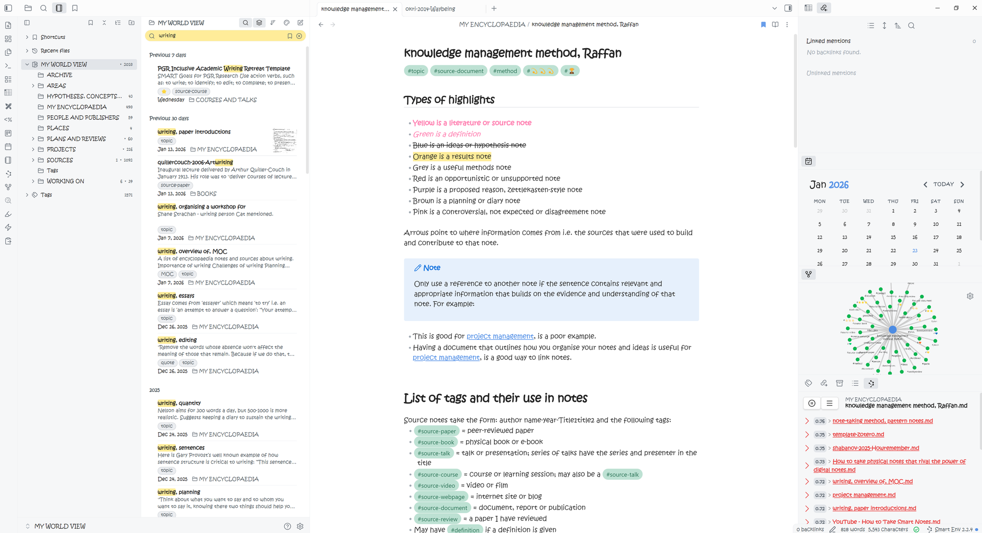

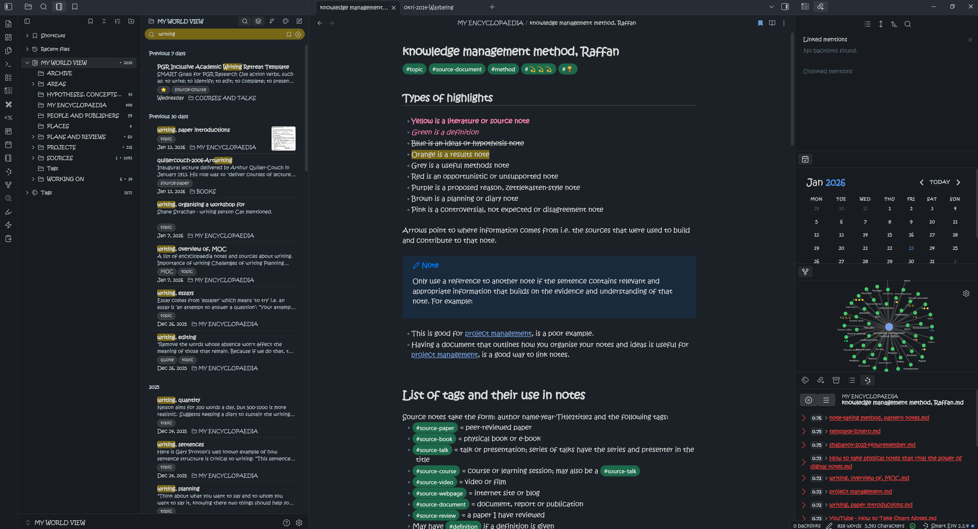
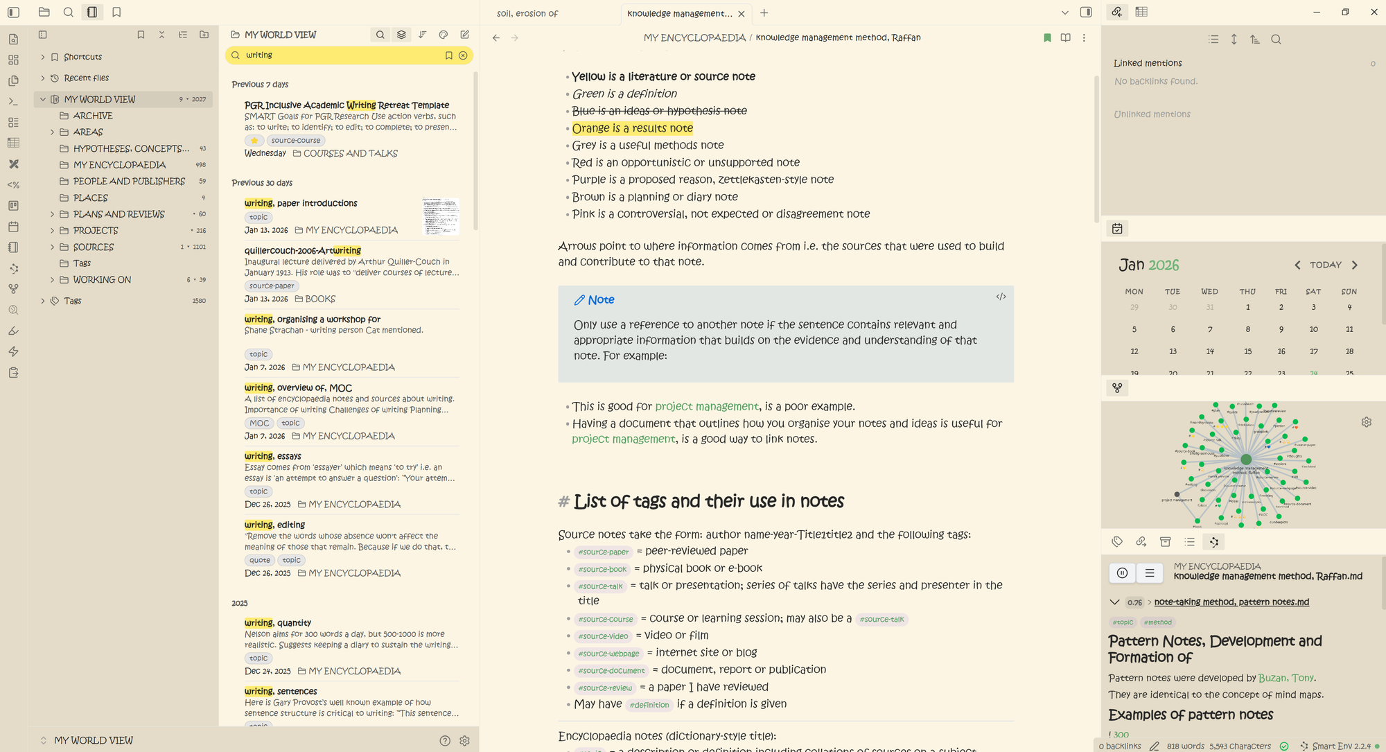
4. Blue Topaz by Whyl (215,467 -> 796,761)
Blue Topaz is a theme I use every now and again. It was my default for a while. Blue Topaz is pretty calm and relaxed and more muted than Things. My 2023 take was that I was not a fan of it in dark mode because the colours were a bit weird but my 2026 take is that I actually quite like it. It's got a slightly funky vibe. I prefer the file structure in this one than ‘Things’ because the difference between notes and folder is more obvious something else which I find helps with the visual navigation.


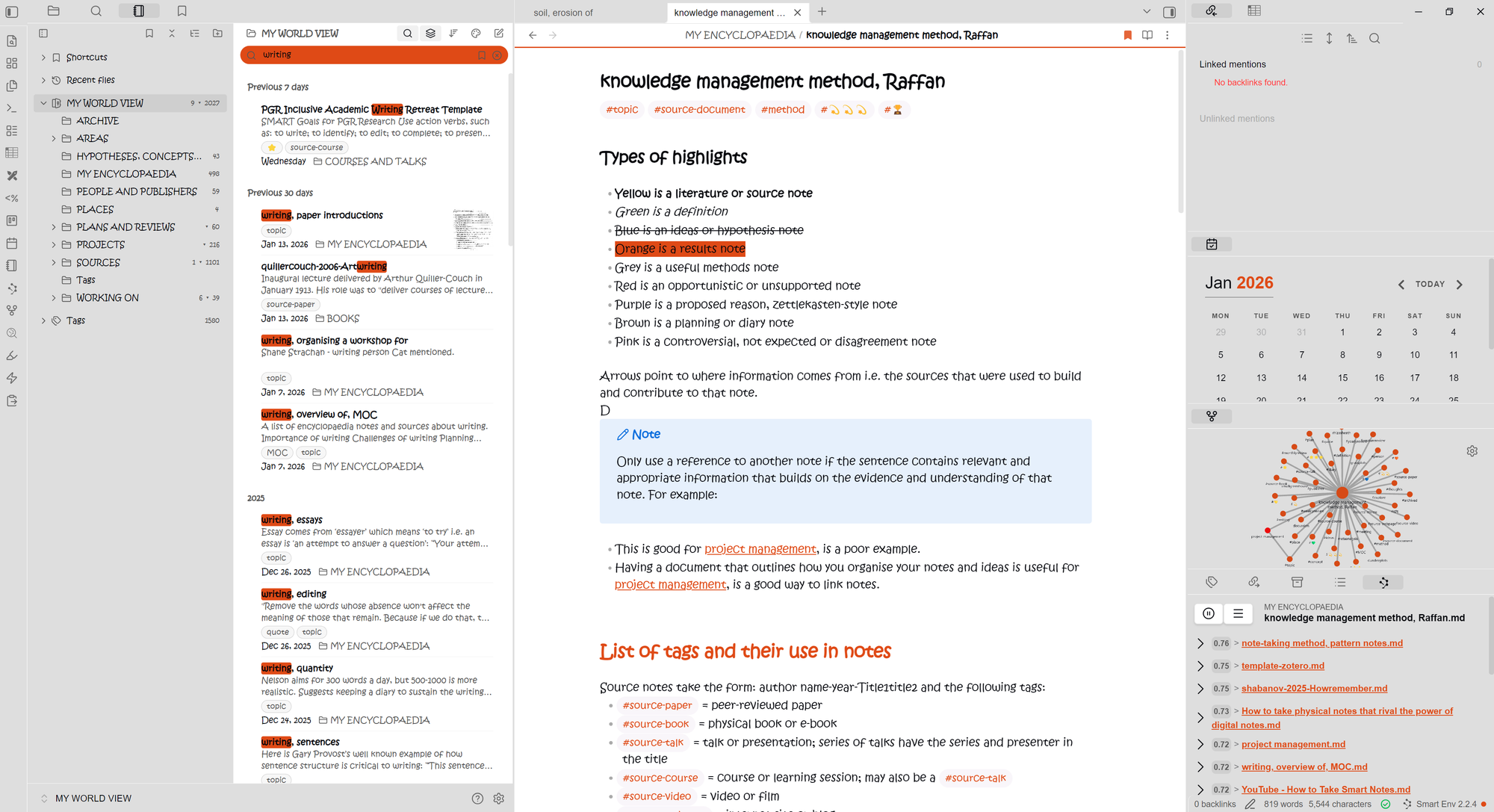
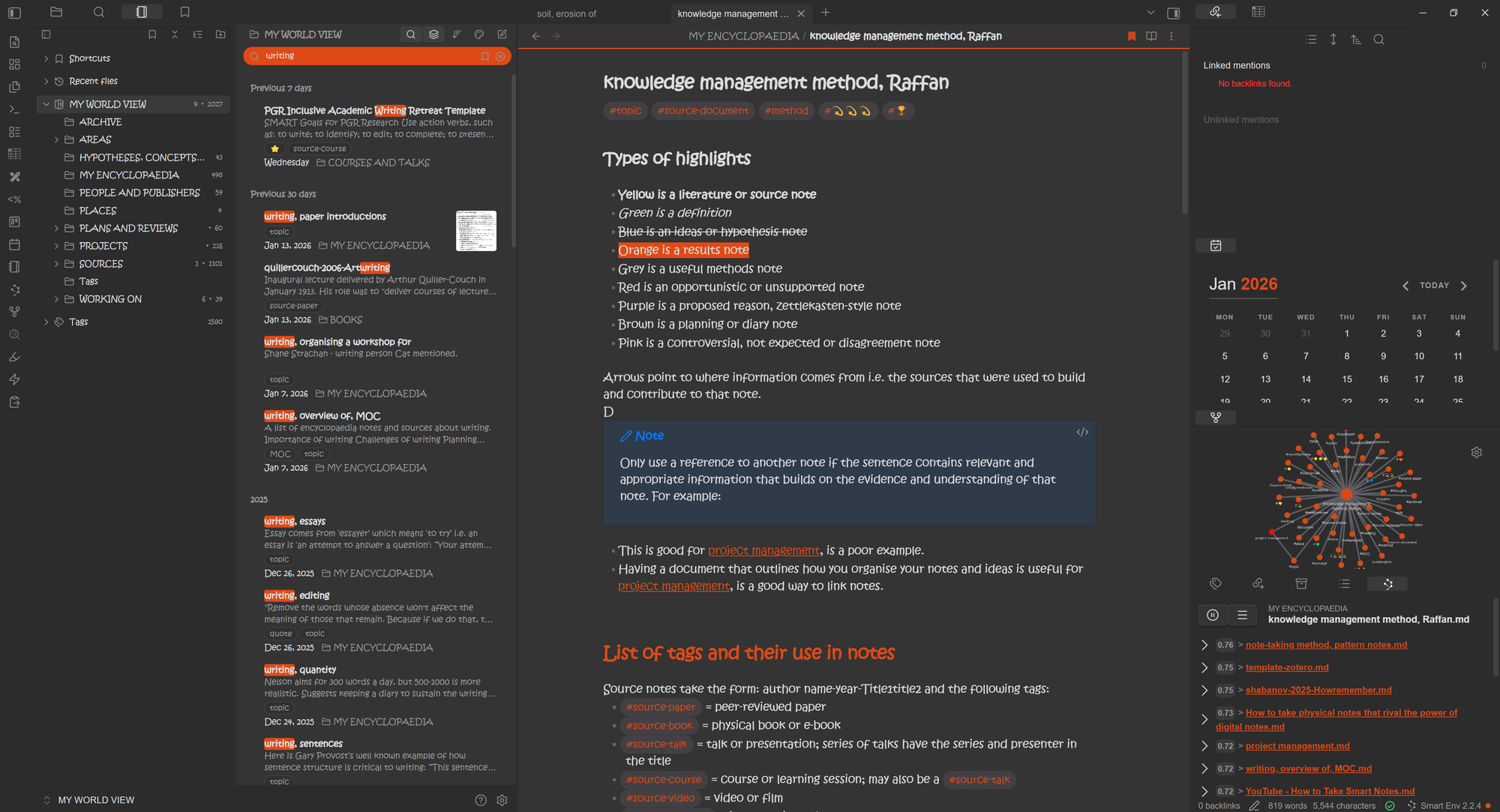
5. AnuPpuccin by Anubis (26,527 -> 703,496)
I wasn't wrong when, back in 2023, I said this was a theme to watch. It moved from number 33 on the list right up to 5th place, the biggest move of any theme. The magic in this theme is its customisation; out the box it is quite muted. So if you are focused on 'out of the box' it's not a strong contender in my opinion. Conversely 'under the hood' it's probably near the top with its sweet range of customisable features through the Style Settings plugin.
It was voted best theme in the Gems of the Year 2022 awards.


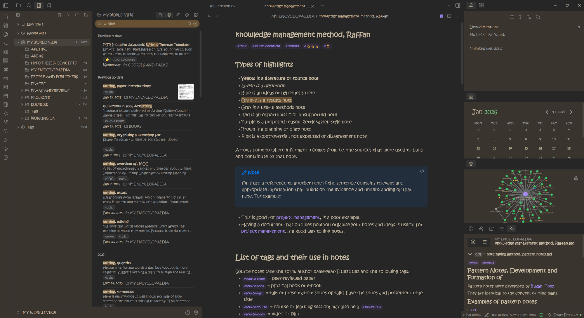
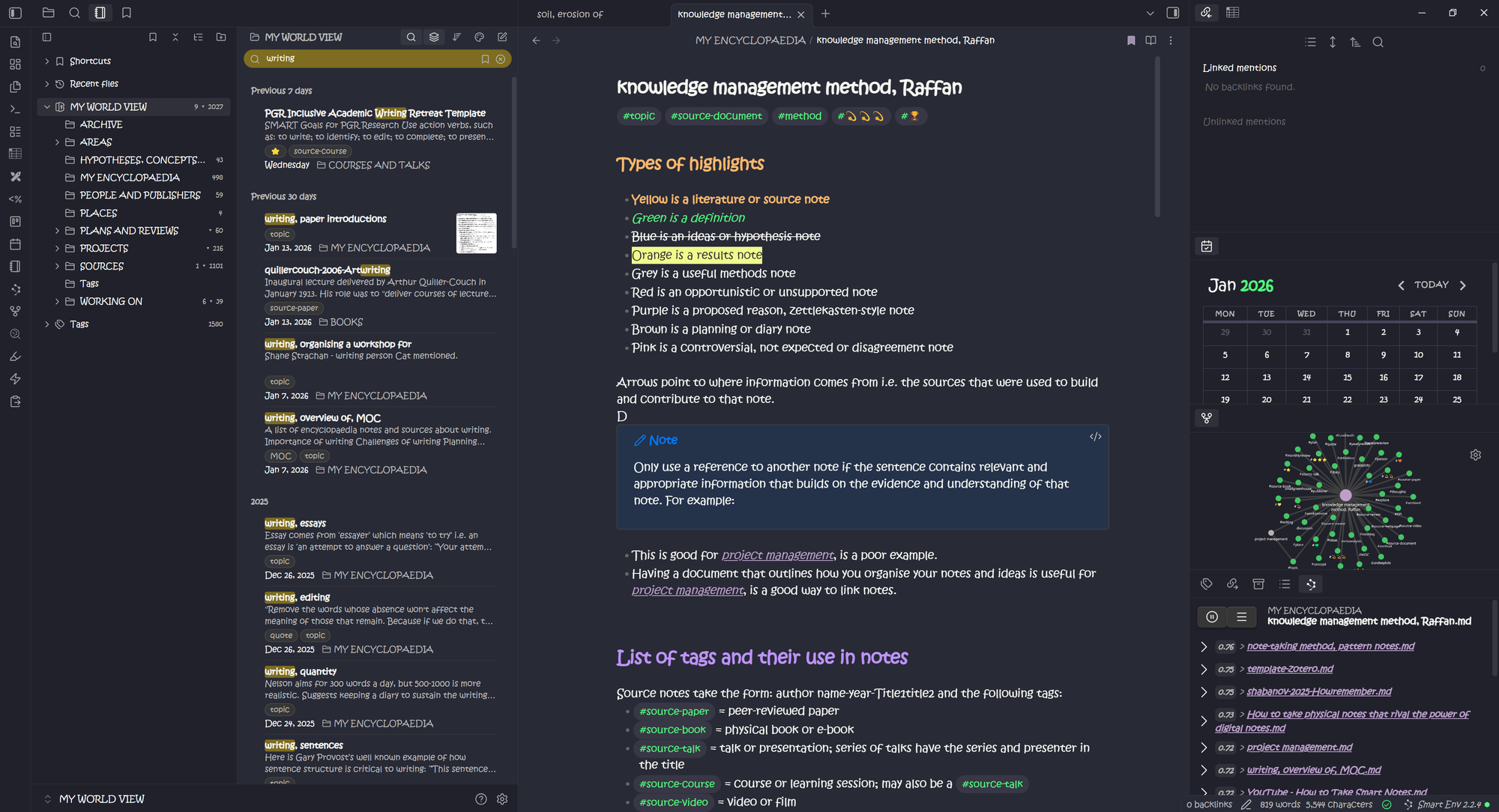
6. Obsidian Nord by insanum (156,154 -> 585,112)
I love the description of this theme on the NORD github page;
“An arctic, north-bluish color palette. A total of sixteen, carefully selected, dimmed pastel colors for a eye-comfortable, but yet colorful ambiance. … Nord consists of four named color palettes providing different syntactic meanings and color effects for dark & bright ambiance designs.”
With colour themes set around ‘Polar Night’, ‘Snow Storm’, ‘Frost’ and ‘Aurora’, what’s not to love? This one absolutely gets my top mark for inspired design.
I think it also has to be one of my favourites for dark mode. At first, I wasn’t sure about the blue, but after seeing a lot of the other dark mode options out there I think (personally) this is one of the better ones. It’s also pretty smart in light mode too. Out of the box this theme is sleek, well-toned and really well thought out. I would say Obsidian Nord gets my no. 1 spot for out-of-the-box effectiveness.


7. Atom by kognise (146,812 -> 461,539)
A really nice clean interface with bright blue and yellow. I like this one. It's clean, and transfers really well between light and dark; better than the Default theme IMHO. Otherwise I had to compare this one side-by-side to the Default theme as it seems pretty similar. The highlighter is a little brighter as are the tags, page links and side bars. This is a good one if you want to use the same theme switching between light and dark. The colours are pretty consistent between the two which is very challenging to do.


8. Obsidianite (146,812 -> 418,688)
Obsidianite is a dark-optimised theme. Super cool name for this one and some great colour choices. When you just focus on one mode, it frees up a lot of creative space. Therefore there are some nice creative touches in this theme. I’m a huge fan of the note link underlines. Note dividers are cute and the choice of colours is very good. If you like to also use light mode, this theme won't be for you as some featureds don't work well e.g note links are whited out when you hover. All-in-all though a fab dark option if that's your thing.
9. Wasp by Santi Younger (74,583 -> 350,675)
Wasp comes into its own in dark mode, it is not currently designed for use in light mode. I love the yellow line styling of the sections and can see where the inspiration has been drawn from. Santi has a great YouTube channel (and moustache) which I dip into occasionally (the channel, not the moustache…) . He is always full of useful tips and guidance, so I can’t help but be in awe! However this theme is not for me. But clearly 350,675 downloads doesn't agree 😅


10. Typewriter by crashmoney (59,553 -> 324,171)
Another winning theme designed for a focused writing experience. The creator has paid special attention to the font and page colour for the ‘vintage typewriter’ experience. The default font is very similar to Shimmering Focus, so also consider that one if you like it that feature. This one moved up 6 places on the most downloaded list, testament to its consistent popularity and niche style.
You can see how my font choice has perhaps removed some of the nuances of this theme. It's muted colours and structuring still show through though. I do really like this theme and its one I use every so often.


11. ITS Theme by SIRvb (51,296 -> 314,478)
“… designed with readability and customizability in mind”; inspired by "Into the Shadows".
I think this is one of my favourite dark theme modes. It was the second biggest mover from 19th in 2023 up to 10th. It looks like it has had some styling updates over the years which have quite significantly changed its appearance.
I typically find dark theme modes plagued by weird colour combos, but this one works for me, as it just focuses on one; red. I love the heading underlines which clearly separate out the different sections. I'm not sure how long I could sit with the red, but it is nevertheless a great theme that works in light and dark consistently.


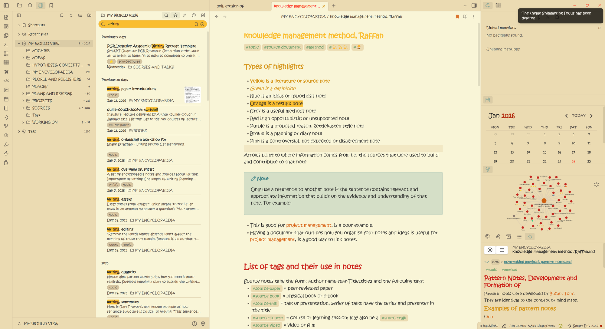
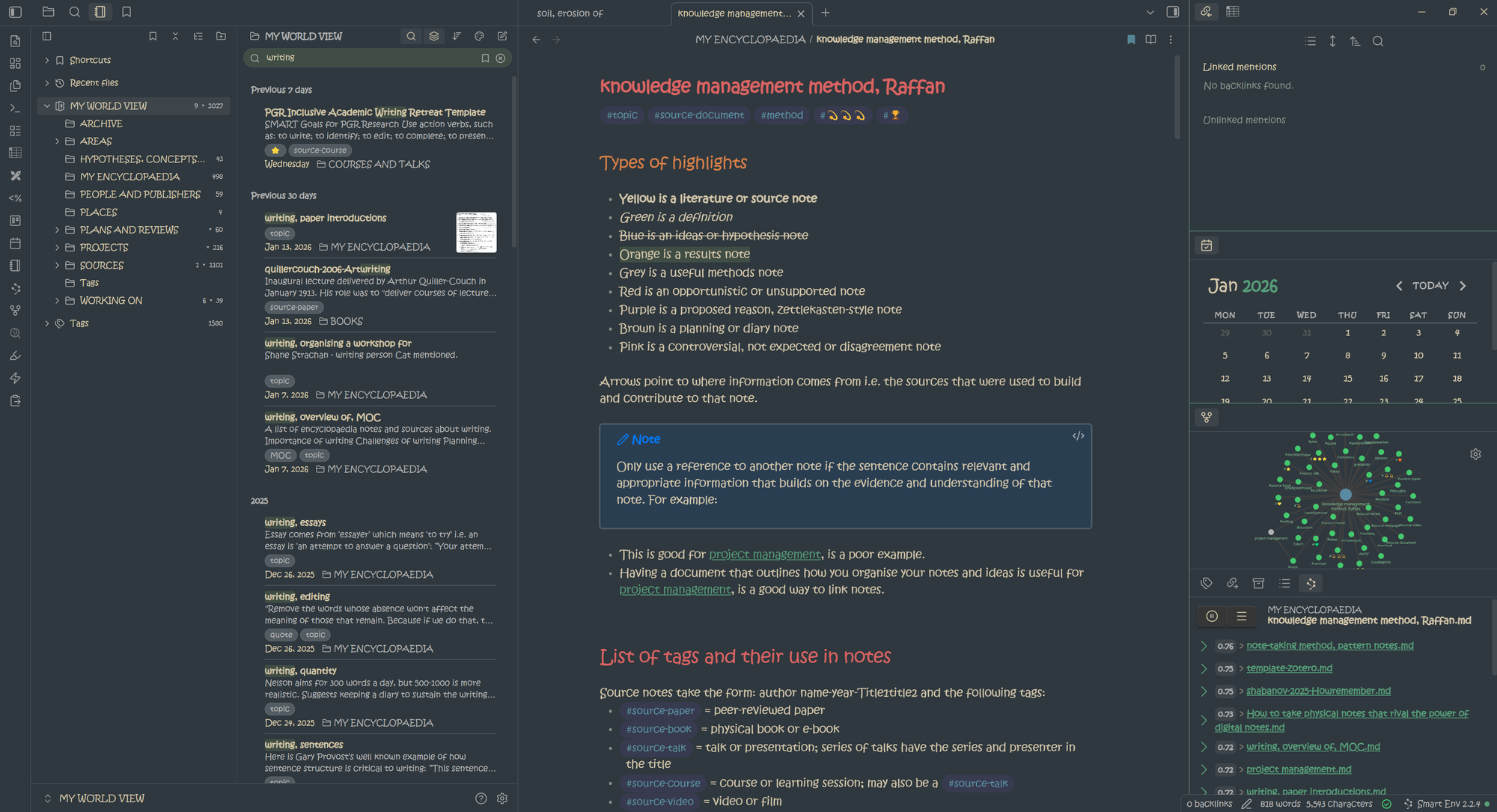
12. Shimmering Focus by pseudometa (81,495 -> 296,404)
Here are my 2023 thoughts: A very interesting theme, which was the winner of the Obsidian Theme Award in 2022. Its ‘Design Philosophy’ is that of ‘Radical Minimalism’, a ‘Condensed Display of Information’ and a ‘High Customizability’. I noticed the side bar on the left disappear, which I realise I don’t really use anyway. When I first installed it I thought I wouldn’t like the standard font choice, but actually, you know what? I think I really like it! I much prefer the light mode. This will be one I come back to for sure. And do you know what else I love, there is a bar at the side of the paragraph so I can tell the section I’m working on. That’s a nice touch. I can see why this theme won an award.
At the time of writing in Januray 2026 this is my current theme; who knows what I might end up with by the end of this list. Looks like it has had some styling updates including a move away from a blue tone to a more yellowy undertone.


13. Obsidian Gruvbox by insanum (59,689 -> 282,388)
Gruvbox has an interesting yellow or ‘solarized’ colour scheme going on. I mean it’s like, woo sunshine! In 2023 I wrote that I didn't think I could work on this for a long time, but in 2026 I think I like it more.
“Designed as a bright theme with pastel ‘retro groove’ colors and light/dark mode switching in the way of solarized. The main focus when developing gruvbox is to keep colors easily distinguishable, contrast enough and still pleasant for the eyes.”


14. Prism by Damien Korcz (68,219 -> 256,905)
Prism was the point at which I realised I probably should install the ‘StyleSettings’ plugin in 2023. I really like Prism. Clearly styled on the purple of Obsidian, it has some really nice features, such as making it super obvious what tabs/views are open. I like the subtle colouring, the big bold headings and the boxy approach. Overall a very inspired minimalist design which I like.
I feel this is another one that switches over to dark mode well, though I feel is maybe a little bright. I’m definitely a fan of light and dark having the same colours to denote the same thing. There are a host of customisation options with Prism that make this even better if you want to go 'under the hood'


15. Sanctum by jdanielmourao (91,928 -> 255,312)
“Sanctum’s a minimalist theme for creating a serene space of retreat, for thought and uninterrupted work.”
An interesting design choice with the orange; I wonder if that is inspired by the orange colours that buddhist monks wear? That’s pretty inspired if it is. Night mode switches to green which is nice and ‘foresty’ which is also a cool touch. It’s definitely minimalist and it enables you to focus on the words rather than complicated design. It's not one for me but I can appreciate the design approach this one has taken.


16. Primary by Cecilia May (247,768)
The first newcomer - if you can call since 2023 a newcomer - to the list. Though it was around in 2023. I love Primary - I used it for a long while in 2025. It is probably the best out of the box theme. It looks great across light and dark, is soft and relaxing. Colour combos are great; they stand out without standing out (😕). I love this one; if this colour scheming is your vibe, I recommend.
"Primary is soft, chewy, comforting — like a chocolate chip cookie, or a warm brownie. Primary instantly puts you in a relaxed state that opens the door to creativity and exploration. Wonderfully executed down to the smallest details, Primary ran away with first place." Obsidian Judge; 2021 Best Theme
17. Catppuccin by Marshall Beckrich (245,246)
Catppuccin is another theme that is new to the top 35 but was around in 2023. This is a nice theme that works well in light and dark mode. It has a pleasant set of colours out the box though I prefer their use in dark mode. The colouring is maybe a little bright, but that could just be because I've been staring at the screen for a longer period of time than when I was higher in the list!
18. Dracula for Obsidian by jarodise (80,582 -> 239,636
It's a great name and inspiration, but not a theme I am personally keen on, both in 2023 and 2026. I do like the outlines and the background colour is good too, but it is too intense for my aging eyes 😆. There is no light mode for this one, because that would make Dracula disappear in a poof of smoke, don’t you know.
19. Tokyo Night by tcmmichaelb139 (230,152)
A great dusk to night theme, Tokyo Night has some inspired uses of colour. I would say is much better in dark mode as I'm not a fan of the foggy grey background in the light. The colours transfer well across themes which is great to see and makes separating headings, links and tags etc super intuitive when you switch modes. I would say this is a theme for the 80% dark user! It's a great dark theme.
20. Border by Akifyss (225,441)
"A clean and highly customisable theme for Obsidian."
Out of the box this theme is clean and well-designed; the distinctive border giving this theme its name. As the tag line suggests, to get the most of this theme you'll need to head to the Style Settings plugin and configure to your personal choice. However if you don't want to, it's great as is with some good colour choices that set everything apart without drawing your eye too much individually.
If you want to make the most of those customisable borders and card-style layouts, you'll need Style Settings.
21. Everforest by MrGlitchByte (56,057 -> 196,670)
“Everforest is a green based color scheme, it’s designed to be warm and soft in order to protect developers’ eyes.”
I didn't have anything to say about this theme in 2023 apparently🤦🏻♀️. I don't know why because this is a lovely theme. Forest by name, forest by nature. Lovely greens; slightly solarised in the light version and kind of deep foresty in the dark. Feels like a trusty notebook out on fieldwork. It has great use of colour in the headings and a slight minimalist nod in that bold/italics/score out are not coloured. Might have to revisit this one from time to time in my own vault.


22. 80s Neon by deathau (55,222 -> 176,603)
Dark, retro-future 80s inspired theme. This is one of the funkier themes available with a cool purple and pink vibe going on. It also has some neon lighting effects behind the sub-headings which is pretty cool too. I think this would be fun to try out for a short while but I’m not sure I could use it long term.
Couldn't get this to install in 2026 so 🤷🏻♀️

23. Cybertron by nickmilo (33,012 -> 34,748; +5.0%)
Whilst no longer updated, Cybertron offers a fun dark theme vibe. It's useable in light theme mode, but dark is its speciality. Created by the ever lovable and hard-working Nick Milo at ‘Linking Your Thinking’. A dark mode theme with inspiration drawn from the likes of videos games and movies and Keanu Reeves, this sets a bar for thoughtful design. In 2023 I said I’m not a fan of the colouring but as Nick says:
“You will either love this theme, or avoid it at all costs.”
I’m afraid it’s the latter for me, but many disagree. In 2026 I say, you know what? I kinda like its funky vibes. Am I going to use it? No, but I like Nick's approach to create something inspired and a little different.
I can highly recommend his Obsidian flight school. Personally there are too many different colours for me in this theme and I’m not a fan of the background colour. That being said I like the design aesthetic he is going for and I think it is very inspired.

24. Willemstad by tingmelvin (168,060)
"This theme is made for work. You download it, and it comes pretty much without colour. Tabula rasa."
Oooh! This is a nice theme - very boxy. I say 'ooh' because this is a completely new one to me that I havn't tried before I started writing this. If you like nice clear section headings then this one is for you. It has many colour personalisation options if you should wish to so venture, but out the box, I think the colours are really great. I will definitely return to this one, but the blocky heading colours may not be for you if you want something more subtle.
25. GitHub Theme (154,025)
If you are a fan of GitHub, then this may be for you. It follows a similar colour theme. Personally it's not for me but I respect those who wish to have minimal styling changes to reduce cognitive load as you navigate different apps. Or you just like the design.
26. Solarized by harmtendder (34,748 -> 150,788)
"☯️ Precision colors for machines and people"
I find the text hard to see in dark mode, but I do rather like the use of colour in light mode. As the name suggests it falls into the family of solarized styles with the yellow screen cast. This theme keeps your accent colour choice, so that is where the purple styling comes from. If you are looking for complementary light and dark with consistent colour scaling/choices between the two, you might want to try this one. From me, it's a no.


27. Notation by deathau (46,765 -> 134,414)
In 2023 I couldn't get this theme to work and wondered whether it was a clash with a plugin. Now in 2026 I can display it in all its Notion-inspired glory. There are some interesting design choices for this one, with its centralised note heading, navigation arrows and bookmarking. The colours are a little too muted in my opinion, but the design choices to align with Notion are novel.
28. Typomagical by Hung-Su Nguyen (26,992 -> 124,502)
I like Typomagical. It’s super clean, no fuss styling is pretty appealing. I love the font use here - as you'll see in 2026 I have over-written the font type and it doesn't work for this them. So if I was to use this I would switch, but for the purposes of today's exercise I wanted to keep it all consistent across themes.
This was my theme for a long while in 2023, until I switched to Things.
It transfers between light and dark mode really well which is partly why I find it appealing. I think the major reason is the ‘out-the-box’ font choice. Definitely one of my favourites this one. Ideally I would have liked to seen more definition between the general text and the headings. I also really like how the links stand out too.


29. Terminal by zcysxy (31,559 -> 32,539; +3.1%)
Well, this is a special one! If you want to go all retro and remind yourself of what computers used to be like then head over to ‘Terminal’. The green reminds me of the Matrix. I used to code in R in a similar theme. It was pretty fun to think I was coding an alternate universe where machines rule the human race…but I digress. I did find it a bit trickier to navigate around the menus and things using this theme, but top marks for fun originality.


30. Ono Sendai by pH (28,158 -> 117,292)
I’m thinking maybe this was inspired by the Sega development company; Ono Sendai? Some funky design points with this theme. The dark mode uses some interesting and vibrant colour highlights with the blue which I’m not such a fan of. A bit of a weird one now as it is currently unmaintained so best to avoid if you run current versions of Obsidian.


31. Obuntu by Dubinin Dimitry (28,884 -> 103,621)
Modelled on Obuntu so another one where design choices are made according to other computer programs/software/OS. Not really a fan of the dark orange, and not one I would personally choose.


32. Dracula Official by Dracula (102,920)
Dracula is clearly a fan of Obsidian... Only available in dark theme. An interesting range of colour choices that I think don't complement each other too well. That being said, I love the background colour; a kind of dark night navy which is pleasant on the eyes.
33. Encore by Lucas Champagne (102,332)
"Unlike most themes, Encore's initial visual impact is subtle. Its focus is on cleaning up the UI, refining typography, and enhancing the visual hierarchy of Obsidian. This creates a more streamlined and intuitive experience. You'll also find subtle, delightful design elements sprinkled throughout. Encore makes no changes to the app's core layout, ensuring your workflow remains familiar."
Encore looks like a good theme with some nice style choices. However it recommends the use of a non-standard font: Rubik. It also doesn't work very well with my accent colour. If you want to use this one you'll need an accent colour that can stand up to the grey. It's got some nice rounded elements, translucency options and works well in light and dark. Page dividers have a cute Obsidian logo which is really cool. Overall it's a muted theme.
34. Pink Topaz by Mouth on Cloud (101,210)
"This is a pink obsidian theme for stimulating happiness. It is designed to create the most compassionate and sweetest environment for reading, thinking and writing."
If pink is your thing, then this one is for you. I can see how the colour choices come through. It's similar in structure to Blue Topaz which ranks number 4 on this list, and which I prefer. It works better in light. Dark is a little to bright for me to use. There are no Style Settings so you get what you see below.
38. Shiba Inu by Farouk (96,560)
"An elegant, Japanese-inspired theme for Obsidian. The Shiba Inu Theme was designed for users who want a calm, warm, and comfortable workspace using Obsidian. Shiba Inu is conceived to stimulate your creativity and your productivity."
Just creeping in last on this top 35 list is Shibu Inu, a Japanese-inspired theme. This theme is no longer developed by its creator, so bear this in mind if you choose it. It will work best when used alongside the Style Settings plugin, but out of the box it also works OK. I like the look of the callouts and the muted colour choices. The peach colour is very pleasant. Not one I will be using but I love the design inspiration choice.
Bet you wish I would keep going don't you? I'm working on it!
Round-Up
I hope that you have enjoyed these screenshots. I left my initial draft using Typomagical, but then had issues with make.md so I switched to Things in light mode.
If you’re looking for the up and coming theme then you might want to check out AnuPpuccin. Once you dive deeper into this theme, it is super loaded with options. There are some cool rainbow palettes to play about with including custom tabs and backgrounds, custom callouts and checkboxes plus more besides. Looks to be a very powerful theme and one I clearly need to have a play around with.
Next procrastination session sorted.
I’ll leave my top out of the box, and the next 35 themes for another day…
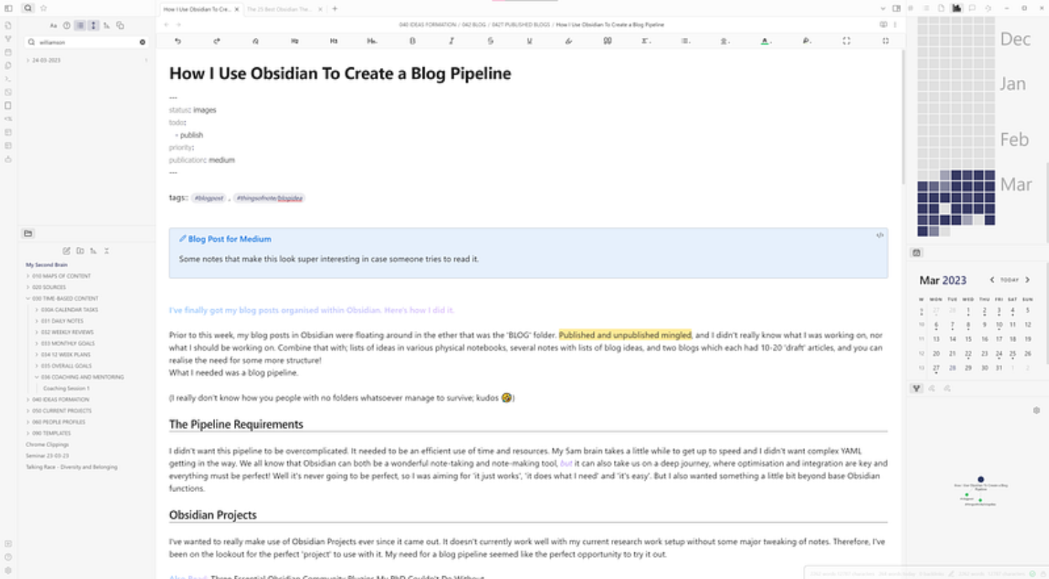
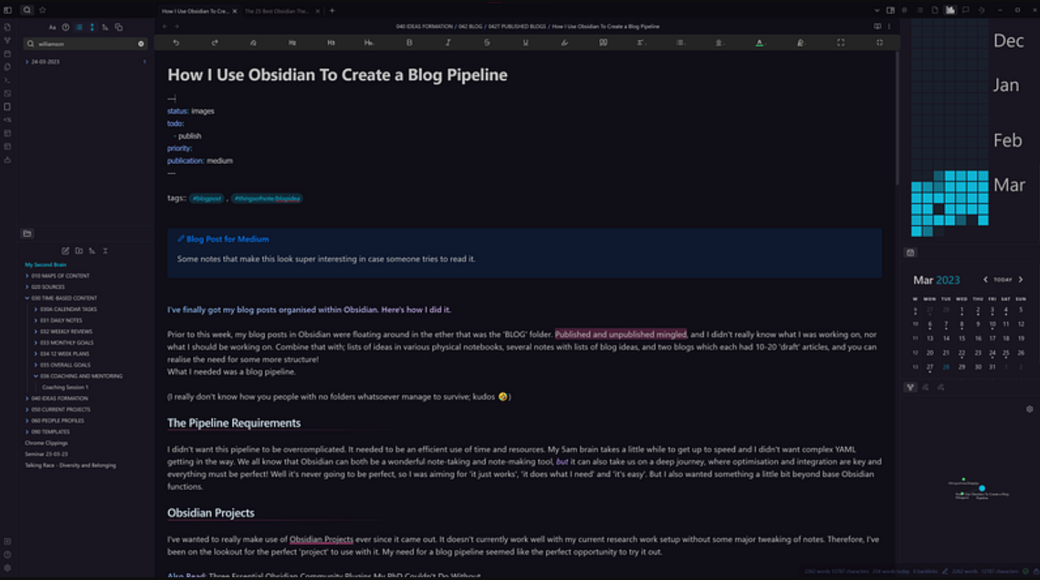
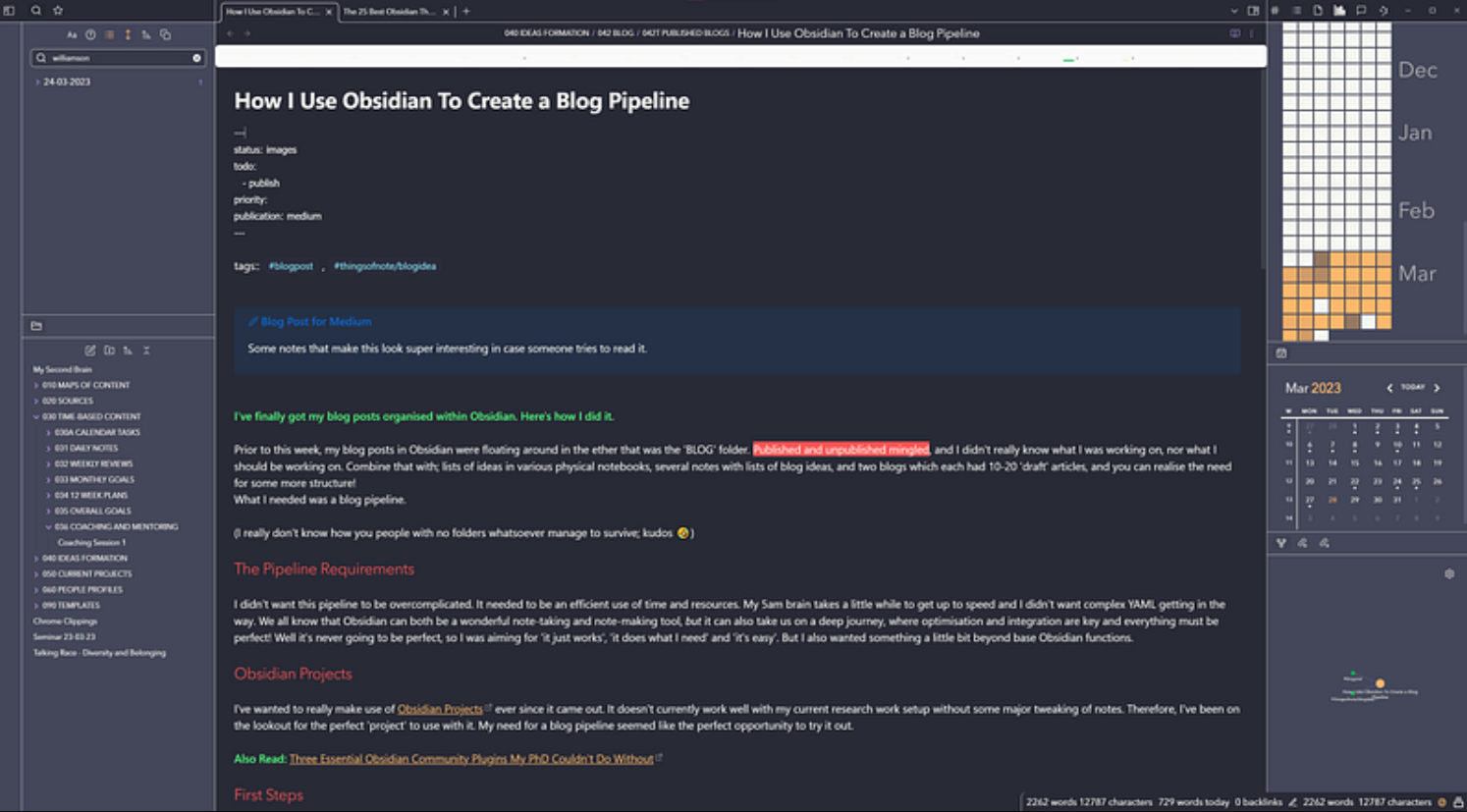
If you’re curious about How I Use Obsidian To Create a Blog Pipeline it’s here on Medium.
Did you have a favourite? Are you a light and dark mode switcher like me?; I even have a custom hot key for light (Alt+L) and dark (Alt+D). Or have you gone out on your own and gone down the mega customisation route?
Until next time; procrasta-la-vista baby!


Comments